
This is an update I’ve been excited about for a while… A brand new Flow Builder!
The new Flow Builder is much more visual. It will feel familiar to existing users, and more welcoming and intuitive to new users. Here are the highlights.
Horizontal UI
Steps are now laid out horizontally. You scroll horizontally to get to them. It feels more like a storyboard.
I think it’s nice that all the content is at the same horizontal line of sight. It makes it easier to scan through. For most flows, it’s also a more optimized use of space.
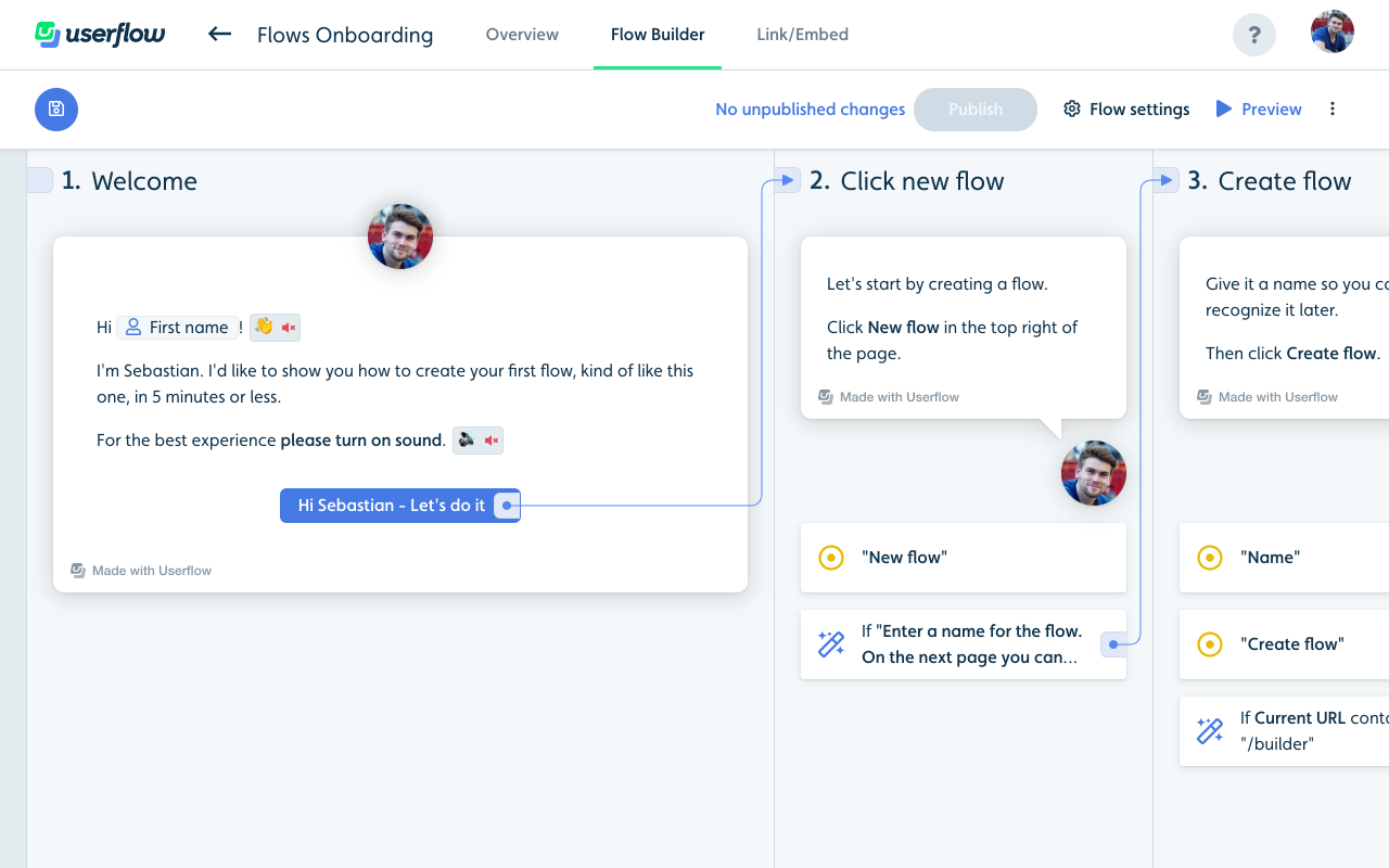
Links between steps
Blocks that have actions (buttons, tooltips and triggers) now have a little light-blue outgoing port to the right of them. Steps have an incoming port in their top left. Arrows are drawn between blocks and steps that are linked. This provides a visual overview of how steps are tied together.
You can link from a block to a step simply by clicking the outgoing port and then clicking the step you want it to go to. You can also click the “+ Add step” on the far right to add a new step and link to it in one go. You can click an existing link’s outgoing port to edit it. Press Delete/Backspace to remove it. Cmd + click on an outgoing port to scroll the target step into view (it’ll flash yellow, too).
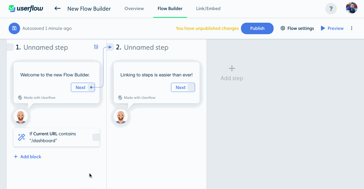
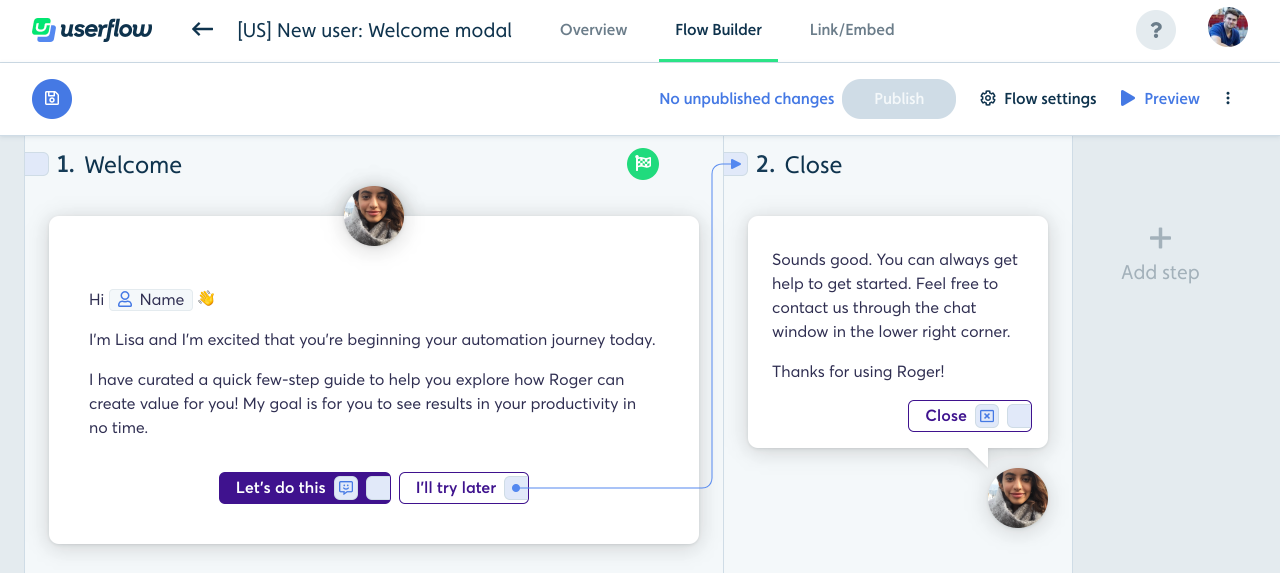
Fidelity
Steps are now displayed almost exactly as they’ll look in the user’s browser. Same size and full theming. Here’s an example from Roger with their custom font, colors and avatar:
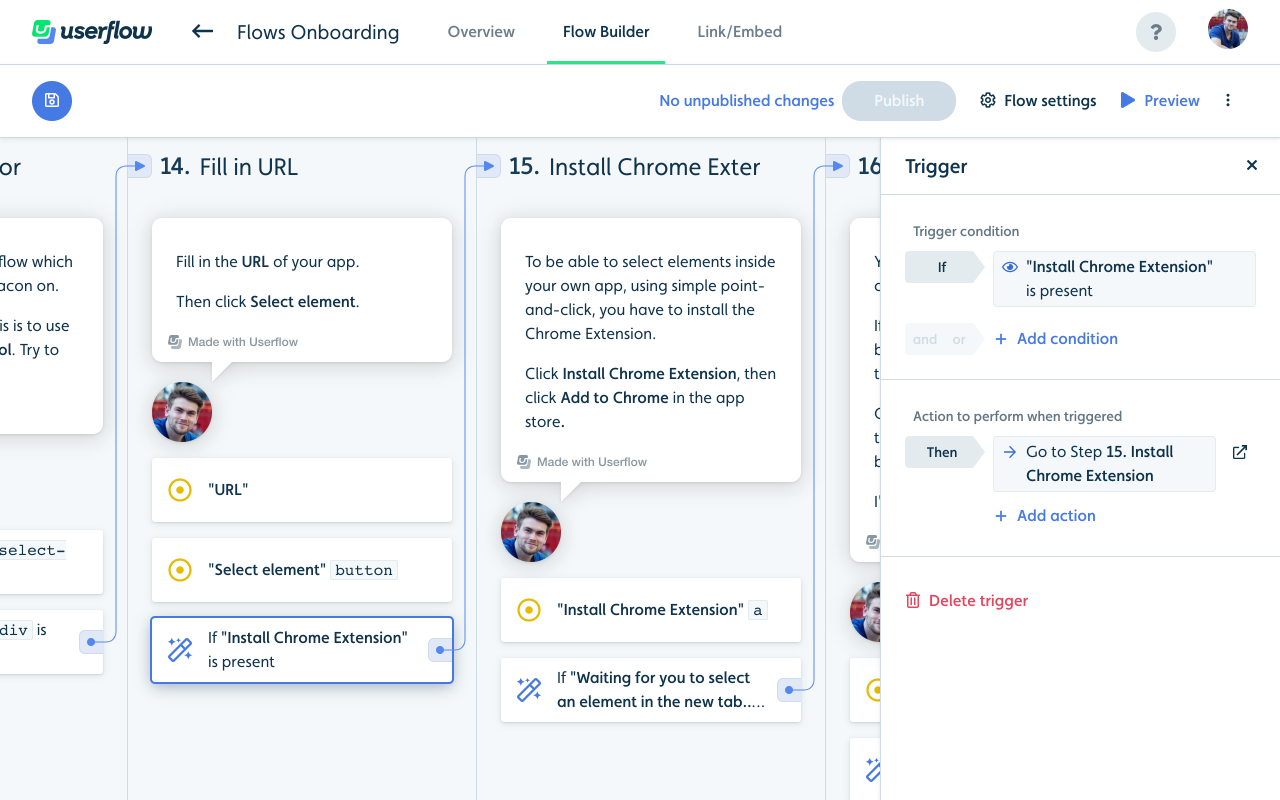
Side panel
Contextual options for blocks/steps (e.g. if you click a button) now open in a panel sliding in from the right. I think this is better than the popover that appeared in the middle of the screen before for 2 reasons: 1) It doesn’t block other content (e.g. the other blocks around it). 2) No vertical scroll necessary to make the popover fit into the viewport.
I hope you’ll like the new Flow Builder! 😀