
We’ve added the ability to style the speech bubble and its buttons differently from step to step.
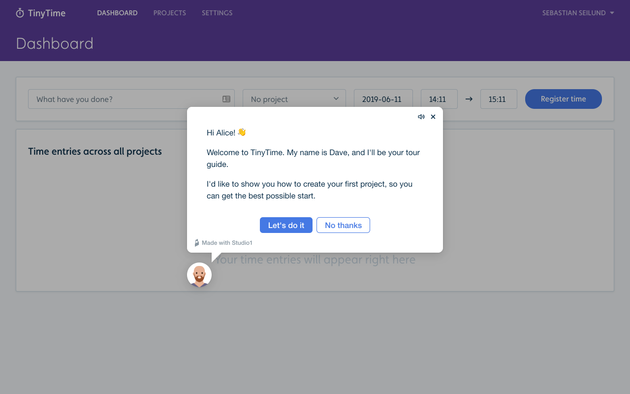
Modal steps allow you to put the content directly in the face of the user. This is great, for example, for the first step in an onboarding flow. This way, you make sure that the user sees it. To turn a step into a modal, click the avatar in the flow builder, and then check “Modal” under “Appearance”.
Primary buttons stand out with a more prominent appearance than regular buttons. This is useful when you want to lead the user in a specific direction. To make a button primary, click it in the flow builder and then check the “Primary” radio button under “Appearance”.
Coming up soon: Tooltip steps, where the speech bubble is anchored and placed next to an element you select.